Showing posts with label XAML. Show all posts

Sunday, February 21, 2010

WPF 4.0 New Features: Windows 7 Taskbar Integration

In WPF 4 there are some features which help us to easily integrate our software with Windows 7 Taskbar. Some of these features are showing thumb buttons in the thumbnail preview, showing progress in the taskbar item, accessing jump and task lists in items’ context menu. All of these features are nicely wrapped in classes and added as dependency properties to Window and Application classes.
overview Windows 7 Taskbar components overview

Let’s start with describing what’s what in Windows 7 Taskbar.

whats_what

whats_what2

WPF Classes for integration

Now, let’s take a look at the classes that WPF 4 provides for interaction with these components. All classes are defined in System.Windows.Shell namespace.

  • TaskbarItemInfo – provides settings of how the taskbar thumbnail is displayed
  • ThumbButtonInfo – represents a Thumb Button
  • JumpTask – represents a shortcut to an application that can be started from the context menu
  • JumpPath – represents a link to a file in the context menu

The Countdown Timer example

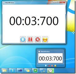
Now, for better understanding of the concept of using taskbar components, I have designed a simple application which just counts down one minute. I’ll explain it by breaking it down to its basic functionalities. Let’s take a look.

The Thumb Buttons

Thumb buttons are buttons which are displayed in the thumbnail preview (see overview picture above). They can be used as quick access to main functions of the application. They are defined using the ThumbButtonInfo class.

<Window.TaskbarItemInfo>
<
TaskbarItemInfo x:Name="taskBarItemInfo"
ThumbnailClipMargin="40,40,40,100"
Description="Countdown Timer">
<
TaskbarItemInfo.ThumbButtonInfos>
<
ThumbButtonInfoCollection>
<
ThumbButtonInfo
DismissWhenClicked="False"
Command="{x:Static local:MainWindow.CmdStart}"
CommandTarget="{Binding ElementName=mainWindow}"
Description="Start"
ImageSource="Resources/play.png"/>
<
ThumbButtonInfo
DismissWhenClicked="False"
Command="{x:Static local:MainWindow.CmdPause}"
CommandTarget="{Binding ElementName=mainWindow}"
Description="Pause"
ImageSource="Resources/pause.png"/>
<
ThumbButtonInfo
DismissWhenClicked="False"
Command="{x:Static local:MainWindow.CmdStop}"
CommandTarget="{Binding ElementName=mainWindow}"
Description="Stop"
ImageSource="Resources/stop.png"/>
<
ThumbButtonInfo
DismissWhenClicked="False"
Command="{x:Static local:MainWindow.CmdReset}"
CommandTarget="{Binding ElementName=mainWindow}"
Description="Reset"
ImageSource="Resources/reset.png"/>
</
ThumbButtonInfoCollection>
</
TaskbarItemInfo.ThumbButtonInfos>
</
TaskbarItemInfo>
</
Window.TaskbarItemInfo>


Now, we can see that TaskbarItemInfo has sereval important properties:


  • ThumbnailClipMargin – this is the area that will be shown on the application thumbnail


  • Description – this is a description that will be shown in a tooltip above the thumbnail


Then we define the thumb buttons. For each button we can provide a description, a source of the image to be displayed, and a command to be executed (there are other properties, try to investigate them if you’re interested).


The Progress Indicator


Windows 7 can show a progress indication in the taskbar which is quite useful for some applications (for example Internet Explorer showing download progress, or in our countdown timer – the timer progress). TaskbarItemInfo has two properties for showing a progress indication in the taskbar.


  • ProgressValue – a percentage value, ranged from 0 to 1 controlling the current progress


  • ProgressState – an enumerable which controls the current state of the progress indicator.


ProgressState can take the following values:


  • None – the progress indicator is not active


  • Indeterminate – the progress is indeterminate


  • Normal – a normal state, showing the current progress


  • Error – the progress indicator shows the current progress, but highlights the bar indicating that there’s an error


  • Paused - the progress indicator shows the current progress, but highlights the bar indicating that the progress is paused.


None Indeterm.. Normal Error Paused
progress_none progress_indeterminate progress_normal progress_error progress_paused


Here’s how we can set the progress indicator in code:


taskBarItemInfo.ProgressState = TaskbarItemProgressState.Normal;
taskBarItemInfo.ProgressValue = 1.0 - currentTime.TotalMinutes;


The Jump List


We can allow our application to include it’s own shortcuts and file links in the context menu of the taskbar item. This is done by setting a property in the Application object, called JumpList:


<Application x:Class="Win7Shell.App"
xmlns="http://schemas.microsoft.com/winfx/2006/xaml/presentation"
xmlns:x="http://schemas.microsoft.com/winfx/2006/xaml"
StartupUri="MainWindow.xaml">

<
JumpList.JumpList>
<
JumpList >
<
JumpTask Title="Notepad"
Description="Open Notepad."
ApplicationPath="C:\Windows\notepad.exe"
IconResourcePath="C:\Windows\notepad.exe"/> </JumpList>
</
JumpList.JumpList>
</Application>


So now Windows will display a shortcut to notepad in the context menu of the taskbar item of our application.


whats_what2


Be safe


Just a reminder when you use the taskbar integration of Windows 7 and WPF: The taskbar shortcuts, thumb buttons, progresses, are just to help the user see and do things more quickly. You should not use these components as your application’s main way of interaction with the user. Why? Because first of all, these components are not available in earlier versions of Windows. Also, even if the user runs Windows 7, there are some other concerns: for example the thumbnail preview is not available when Windows Aero is disabled. Of course, don’t worry, your application will still be able to run, just it’s taskbar functions will not be available.


Download Sample


You can download my Countdown Timer application to better understand the use of there components.

Saturday, February 20, 2010

WPF 4.0 New Features: Text

In the next series of posts I will write a little bit about the new features in the new WPF, part of Microsoft .NET Framework 4.0. So let’s begin with the improvements in text.

Text Rendering Stack

Microsoft has significantly improved the way texts are rendered on the screen. They introduced several new options to allow us define the parameters of text rendering. These options are encapsulated in the properties TextOptions. TextFormattingMode and TextOptions. TextRenderingMode of the TextBlock and TextBox controls.

TextFormattingMode can accept the following values:

  • Ideal (the default formatting mode)
  • Display

As for TextRenderingMode, there are four available options:

  • Auto (the default mode)
  • ClearType
  • Grayscale
  • Aliased

The differences in rendering and format modes are difficult to see. The resulting rendered text depends on other properties and use cases – for example: font size, transformations, etc. We can see a simple example using the Display Formatting with normal text and scaled text here:

smalltext zoomed_text

You can see that although display formatting may look better in some cases, it looks ridiculously ugly in other cases, as in when it’s scaled.

Now let’s see a comparison between all of the options in different use cases.

  • Small Text
compare_smalltext
  • Large Text
compare_largetext
  • Rotated Text
compare_rotated
  • Scaled Text
compare_scaled

Here’s an example of how these properties are used. It’s quite simple:

<TextBlock FontSize="8" Text="Display formatting" TextWrapping="Wrap" Margin="5"                       TextOptions.TextFormattingMode="Display"        TextOptions.TextRenderingMode="Auto"                       />


TextBox’s Caret and Selection Brush


Great new thingy in WPF 4 is the introduction of two additional Brush properties of the TextBox control.


  • CaretBrush – specifies the brush of the blinking caret in a TextBox


  • SelectionBrush – specifies the brush of the selection background in a TextBox


Let’s see how these properties are used:


<TextBox Text="CaretBrush" Margin="5">
<
TextBox.CaretBrush>
<
LinearGradientBrush StartPoint="0.5 0" EndPoint="0.5 1">
<
GradientStop Color="LightBlue" Offset="0"/>
<
GradientStop Color="Blue" Offset="0.4"/>
<
GradientStop Color="Pink" Offset="0.7" />
<
GradientStop Color="DarkRed" Offset="1" />
</
LinearGradientBrush>
</
TextBox.CaretBrush>
</
TextBox>


<TextBox Text="SelectionBrush" Margin="5" >
<
TextBox.SelectionBrush>
<
LinearGradientBrush StartPoint="0.5 0" EndPoint="0.5 1">
<
GradientStop Color="LightSteelBlue" Offset="0"/>
<
GradientStop Color="SteelBlue" Offset="0.5" />
<
GradientStop Color="DarkRed" Offset="1" />
</
LinearGradientBrush>
</
TextBox.SelectionBrush>
</
TextBox>


And the two text-boxes look like this now:


textbox_brushes


Bindable Runs


In WPF 3.5 the Runs (objects within a TextBlock or a Document) had their Text properties as standart CLR properties. Now in WPF 4 they are created as dependency properties, and therefore support the power of data binding.


        <TextBlock>
<
Run Text="{Binding FirstName}" />
<
Run Text="{Binding LastName}" />
</
TextBlock>


Custom Spellchecking Dictionaries


Microsoft has added the support for using custom spellcheckers, which can be loaded from a file or from app resources. A property has been added to the SpellChecker class – CustomDictionaries, which is essentially a list of URIs to the dictionary files (which, by the way are simple text files with one word on each line).


Let’s try one. We create a new text file, and call it for example MyCustomDictionary.lex. Note the extension is .lex.


spell_dictionary


Now, we will add a simple TextBox and tell it to include that dictionary in the spellchecker.


<TextBox Grid.Column="2"
Margin="5"
SpellCheck.IsEnabled="True">
<
SpellCheck.CustomDictionaries>
<
sys1:Uri>MyCustomDictionary.lex</sys1:Uri>
</
SpellCheck.CustomDictionaries>
</
TextBox>


So now the spellchecker will recognize the words in this dictionary, and include them in the suggestions.


spellcheck


That’s all for texts in WPF 4 for now. As always, you can download the sample application to better understand how things work.


Download Sample


You can download the sample project by following this link. Note: This is a VS2010 Project. Executables are also included.

Saturday, September 12, 2009

User Control Inheritance in WPF

User control inheritance is very useful in a lot of cases. But it seems like WPF doesn't want us to do that. Have you tried to create a user control (defined with XAML and code-behind) , and then inherit it? The compiler gets very mad at us and says there is an error:

'SomeBaseControl' cannot be the root of a XAML file because it was defined using XAML

Now, what can we do to avoid this unpleasant message?

Variant 1,
Use a custom control for the base class (defined only with code, not XAML)

This is handy sometimes. What you do is create the base control as a custom control, using just the code


public class TestBaseCtrl : Control
{
// Add some base logic here...
}


You can add your controls from the code and create the base logic. Then you can inherit that control even in XAML, like this.


This is a working solution, but it's not very convenient. You don't have the flexibility of XAML in the base control. So let's take a look at the other solution.

Variant 2,
Create the base control using XAML

OK, but how on earth do we do that? We all saw the error message - we cannot define a base control in XAML and then inherit it again in XAML, according to the compiler. However, there is an easy way to trick the compiler to allow us to do that.
The main idea is to create a base control as a custom control again, and then define a control template in XAML. It's basically the same as defining the base control with XAML. Here is what I mean. This is the code-behind for the control:


public class TestBaseCtrl : UserControl
{
public static RoutedCommand TestButton1 = new RoutedCommand();
public static RoutedCommand TestButton2 = new RoutedCommand();

static TestBaseCtrl()
{
DefaultStyleKeyProperty.OverrideMetadata(typeof(TestBaseCtrl), new FrameworkPropertyMetadata(typeof(TestBaseCtrl)));
}

public TestBaseCtrl()
{
this.CommandBindings.Add(new CommandBinding(TestButton1, TestButton1_Executed));
this.CommandBindings.Add(new CommandBinding(TestButton2, TestButton2_Executed));
}

private void TestButton1_Executed(object sender, ExecutedRoutedEventArgs e)
{
MessageBox.Show("This is button 1 from the base control");
}

private void TestButton2_Executed(object sender, ExecutedRoutedEventArgs e)
{
MessageBox.Show("This is button 2 from the base control");
}
}


And this is the control template, defined in XAML:


You can see that we have specified an area of the base control, in which the content of the child controls would be displayed, using ContentPresenter.
Now, let's inherit that control:


Now, the WPF compiler is totally OK with it, and even displays the inherited control in the designer:

And there you go - now you have a base control and an inherited control which both use the power of XAML. Everything goes well in the compilation and the compiler is no longer mad at us:

========== Build: 1 succeeded or up-to-date, 0 failed, 0 skipped ==========

Download sample application

The sample can be downloaded here: Download sample

Sunday, July 26, 2009

Switching WPF interface themes at runtime, Part 2

In my previous post, Switching WPF interface themes at runtime
,I explained how we can easily switch between interface themes at runtime using a simple property and even databinding. That was OK for a single element, or a single window. But what about if we have an application with a lot of windows? Not that hard, just set the property on every window. Yes, that would work, but it has some disadvantages. For example, we change the theme on one window, then we must implement some logic to change it to all other windows that are open, otherwise you are left with windows on the same application with different themes, and that's just ugly. It also can introduce a lot of bugs. And, it is also very boring.

Using a global theme for the application

The idea is that we want to have a theme that should be applied on all of the windows of the application and that can be switched easily at a central location. So I continued working on my ThemeSelector class. I introcuded a property called Global Dictionary, which would be used for all elemenst registered with the theme selector. I also added another attachable property, which is boolean and tells the theme selector whether the element should use the global theme or not.
Let's take a look at the new code:


#region Global Theme

private static List elementsWithGlobalTheme = new List();

private static Uri globalThemeDictionary = null;

public static Uri GlobalThemeDictionary
{
get { return globalThemeDictionary; }
set
{
globalThemeDictionary = value;

// apply to all elements registered to use the global theme
foreach (FrameworkElement element in elementsWithGlobalTheme)
{
if (GetApplyGlobalTheme(element))
ApplyTheme(element, globalThemeDictionary);
}
}
}

public static readonly DependencyProperty ApplyGlobalThemeProperty =
DependencyProperty.RegisterAttached("ApplyGlobalTheme", typeof(bool),
typeof(MkThemeSelector),
new UIPropertyMetadata(false, ApplyGlobalThemeChanged));

public static bool GetApplyGlobalTheme(DependencyObject obj)
{
return (bool)obj.GetValue(ApplyGlobalThemeProperty);
}

public static void SetApplyGlobalTheme(DependencyObject obj, bool value)
{
obj.SetValue(ApplyGlobalThemeProperty, value);
}


private static void ApplyGlobalThemeChanged(DependencyObject obj, DependencyPropertyChangedEventArgs e)
{
if (obj is FrameworkElement)
{
FrameworkElement element = obj as FrameworkElement;
if ((bool)e.NewValue) // if property is changed to 'true', then add to the list of elements and apply theme
{
if (!elementsWithGlobalTheme.Contains(element))
elementsWithGlobalTheme.Add(element);

// apply the theme
ApplyTheme(element, GlobalThemeDictionary);
}
else
{
if (elementsWithGlobalTheme.Contains(element))
elementsWithGlobalTheme.Remove(element);

// apply the local theme instead of the global
ApplyTheme(element, GetCurrentThemeDictionary(element));
}
}
}

#endregion
That's all we need. When the ApplyGlobalTheme is set to true on an element, it starts using the global theme. If this is set to false, the element is switched back to the local theme set with the ThemeSelector, or to no theme at all. When the global theme is changed, the code searches all elements that use it and apply the new one. That's not something very complicated but it makes our lives a lot easier. The ApplyTheme(..) method is the same method I used on my previous post, you can look it up there to understand it better. But just in case, I will post it here:


private static void ApplyTheme(FrameworkElement targetElement, Uri dictionaryUri)
{
if (targetElement == null) return;

try
{
ThemeResourceDictionary themeDictionary = null;
if (dictionaryUri != null)
{
themeDictionary = new ThemeResourceDictionary();
themeDictionary.Source = dictionaryUri;

// add the new dictionary to the collection of merged dictionaries of the target object
targetElement.Resources.MergedDictionaries.Insert(0, themeDictionary);
}

// find if the target element already has a theme applied
List existingDictionaries =
(from dictionary in targetElement.Resources.MergedDictionaries.OfType()
select dictionary).ToList();

// remove the existing dictionaries
foreach (ThemeResourceDictionary thDictionary in existingDictionaries)
{
if (themeDictionary == thDictionary) continue; // don't remove the newly added dictionary
targetElement.Resources.MergedDictionaries.Remove(thDictionary);
}
}
finally { }
}

Using the Theme Selector with the global theme


Changing the global theme is easy. Just one line:


MkThemeSelector.GlobalThemeDictionary = new Uri("/ThemeSelector;component/Themes/ShinyRed.xaml",
UriKind.Relative);

And that's it. All of the elements that use the global theme will be switched. But how to tell the element that it uses the global theme? Just set the ApplyGlobalTheme attached property to true.


Let's see some screenshots.

This is a two-windows application with the no theme applied.


Let's see what happens when we change the global application theme using the Theme Selector.


Great. Both windows switched their themes. With just only one line of code.

Download Sample

The sample application can be downloaded here.

Saturday, July 25, 2009

Switching WPF interface themes at runtime

WPF introduced the use of dynamic resource references. They're very helpful in rich application development. The dynamic resources are loaded at runtime, and can be changed at any time. Dynamic resources could be styles, brushes, etc. WPF however does not provide a convenient way of changing the resource references. That's why I've created a simple class that allows the developers to switch different resources very easy.

Using dynamic resources

Creating and applying a dynamic resource is easy in WPF. First, we need to define the resource:


Then, we have to reference the resource like this:


And that's it. WPF searches for a resource with the given key and applies it when it's found.


Changing the dynamic resources at runtime


As I said, dynamic resources are applied at runtime, that means they can be changed. Let's assume that we have defined several resources like brushes and styles, and we want them to be in two variants - for example a red theme and a blue theme for user interfaces. We put all of the resources for each theme in a different resource dictionary file. For this example, I use the WPF Themes which can be found here: http://wpf.codeplex.com/Wiki/View.aspx?title=WPF%20Themes. So, assume that we have two resource dictionaries:

ShinyBlue.xaml
ShinyRed.xaml

Without these themes, a WPF window should look something like this:


Using the themes is pretty easy, all we need to do is merge one of the resource dictionary to the resources of root control or window:


And now, the window looks like that:


Pretty neat, huh? OK, that's good, but what if we want to change the theme to the red one? We have to go in the XAML code, change the source of the merged resource dictionary and recompile. No way! We should be able to come up with something nicer.

Well, there's a solution. See, everytime when the resources of a framework element are changed (added or removed resources), WPF goes through all elements with dynamic resource references and updates them accordingly. So the solution should be obvious - when we need to change the theme, we can simply remove the old merged dictionary, and add the new one. I searched a bit in the internet, and the most common solution is to clear all merged dictionaries from the collection and then add the desired one. Yes, allright, that would work. But what if the developer has added more than one resource dictionary, not only the one with the theme resources? Everything goes away, and bang, the software is not working. So there should be a proper way of detecting which resource dictionary contains the theme resources, and leave the other dictionaries alone.

It sounds a bit complicated, right? First, search for the right resource dictionary, then remove it from the list of merged dictionaries, then load the new one, and apply it. Yes but what if it could be done jyst by setting one single value to one signle property, and all is OK?

The ThemeSelector class

So there is it. The solution. I created a class which has an attachable property - the URI path to the desired theme dictionary. Now, let's think about finding the right dictionary to be removed when themes are being switched. Kinda obvious solution is a new class that inherits ResourceDictionary. Then, we search all merged dictionaries and remove those which are of this new type. Pretty simple, right? Here's the class:


public class ThemeResourceDictionary : ResourceDictionary
{
}

So it's time to see the real deal.

public class MkThemeSelector : DependencyObject
{

public static readonly DependencyProperty CurrentThemeDictionaryProperty =
DependencyProperty.RegisterAttached("CurrentThemeDictionary", typeof(Uri),
typeof(MkThemeSelector),
new UIPropertyMetadata(null, CurrentThemeDictionaryChanged));

public static Uri GetCurrentThemeDictionary(DependencyObject obj)
{
return (Uri)obj.GetValue(CurrentThemeDictionaryProperty);
}

public static void SetCurrentThemeDictionary(DependencyObject obj, Uri value)
{
obj.SetValue(CurrentThemeDictionaryProperty, value);
}

private static void CurrentThemeDictionaryChanged(DependencyObject obj, DependencyPropertyChangedEventArgs e)
{
if (obj is FrameworkElement) // works only on FrameworkElement objects
{
ApplyTheme(obj as FrameworkElement, GetCurrentThemeDictionary(obj));
}
}

private static void ApplyTheme(FrameworkElement targetElement, Uri dictionaryUri)
{
if (targetElement == null) return;

try
{
ThemeResourceDictionary themeDictionary = null;
if (dictionaryUri != null)
{
themeDictionary = new ThemeResourceDictionary();
themeDictionary.Source = dictionaryUri;

// add the new dictionary to the collection of merged dictionaries of the target object
targetElement.Resources.MergedDictionaries.Insert(0, themeDictionary);
}

// find if the target element already has a theme applied
List existingDictionaries =
(from dictionary in targetElement.Resources.MergedDictionaries.OfType()
select dictionary).ToList();

// remove the existing dictionaries
foreach (ThemeResourceDictionary thDictionary in existingDictionaries)
{
if (themeDictionary == thDictionary) continue; // don't remove the newly added dictionary
targetElement.Resources.MergedDictionaries.Remove(thDictionary);
}
}
finally { }
}
}

As I said, the class as one dependency property and an callback method to handle the event of changing the value of this property. There everything is straight-forward. First, the new theme dictionary is loaded, and then the old one is removed. That's it.

Using the ThemeSelector class

Here comes the nice part. The usage of the class is as simple as changing the value of one single property.
        private void ChangeToRedTheme()
{
MkThemeSelector.SetCurrentThemeDictionary(this, new Uri("/ThemeSelector;component/Themes/ShinyRed.xaml", UriKind.Relative));
}
When this method is called, the theme changes:


The ThemeSelector class and WPF data binding

We can even use databinding to change the themes dynamically. Let's assume that we have a combo box which have two items - the red theme, and the blue theme:


Now, on the element to which we want to apply the theme, for example the root grid in the window, we set the following binding expression:
local:MkThemeSelector.CurrentThemeDictionary="{Binding ElementName=cmbThemes, Path=SelectedItem.Tag}"

So it looks like this:


And that's all. When we run the application, we have this combo box, allowing us to select the theme in runtime.


Download sample application

The sample can be downloaded here: Download sample