In the next series of posts I will write a little bit about the new features in the new WPF, part of Microsoft .NET Framework 4.0. So let’s begin with the improvements in text.
Text Rendering Stack
Microsoft has significantly improved the way texts are rendered on the screen. They introduced several new options to allow us define the parameters of text rendering. These options are encapsulated in the properties TextOptions. TextFormattingMode and TextOptions. TextRenderingMode of the TextBlock and TextBox controls.
TextFormattingMode can accept the following values:
- Ideal (the default formatting mode)
- Display
As for TextRenderingMode, there are four available options:
- Auto (the default mode)
- ClearType
- Grayscale
- Aliased
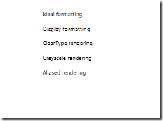
The differences in rendering and format modes are difficult to see. The resulting rendered text depends on other properties and use cases – for example: font size, transformations, etc. We can see a simple example using the Display Formatting with normal text and scaled text here:
You can see that although display formatting may look better in some cases, it looks ridiculously ugly in other cases, as in when it’s scaled.
Now let’s see a comparison between all of the options in different use cases.
Here’s an example of how these properties are used. It’s quite simple:
<TextBlock FontSize="8" Text="Display formatting" TextWrapping="Wrap" Margin="5" TextOptions.TextFormattingMode="Display" TextOptions.TextRenderingMode="Auto" />
TextBox’s Caret and Selection Brush
Great new thingy in WPF 4 is the introduction of two additional Brush properties of the TextBox control.
- CaretBrush – specifies the brush of the blinking caret in a TextBox
- SelectionBrush – specifies the brush of the selection background in a TextBox
Let’s see how these properties are used:
<TextBox Text="CaretBrush" Margin="5">
  <TextBox.CaretBrush>
   <LinearGradientBrush StartPoint="0.5 0" EndPoint="0.5 1">
     <GradientStop Color="LightBlue" Offset="0"/>
     <GradientStop Color="Blue" Offset="0.4"/>
     <GradientStop Color="Pink" Offset="0.7" />
     <GradientStop Color="DarkRed" Offset="1" />
   </LinearGradientBrush>
  </TextBox.CaretBrush>
</TextBox>
<TextBox Text="SelectionBrush" Margin="5" >
  <TextBox.SelectionBrush>
    <LinearGradientBrush StartPoint="0.5 0" EndPoint="0.5 1">
      <GradientStop Color="LightSteelBlue" Offset="0"/>
      <GradientStop Color="SteelBlue" Offset="0.5" />
      <GradientStop Color="DarkRed" Offset="1" />
     </LinearGradientBrush>
   </TextBox.SelectionBrush>
</TextBox>
And the two text-boxes look like this now:
Bindable Runs
In WPF 3.5 the Runs (objects within a TextBlock or a Document) had their Text properties as standart CLR properties. Now in WPF 4 they are created as dependency properties, and therefore support the power of data binding.
        <TextBlock>
            <Run Text="{Binding FirstName}" />
            <Run Text="{Binding LastName}" />
        </TextBlock>
Custom Spellchecking Dictionaries
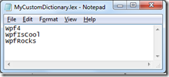
Microsoft has added the support for using custom spellcheckers, which can be loaded from a file or from app resources. A property has been added to the SpellChecker class – CustomDictionaries, which is essentially a list of URIs to the dictionary files (which, by the way are simple text files with one word on each line).
Let’s try one. We create a new text file, and call it for example MyCustomDictionary.lex. Note the extension is .lex.
Now, we will add a simple TextBox and tell it to include that dictionary in the spellchecker.
<TextBox Grid.Column="2"
         Margin="5"
         SpellCheck.IsEnabled="True">
  <SpellCheck.CustomDictionaries>
      <sys1:Uri>MyCustomDictionary.lex</sys1:Uri>
  </SpellCheck.CustomDictionaries>
</TextBox>
So now the spellchecker will recognize the words in this dictionary, and include them in the suggestions.
That’s all for texts in WPF 4 for now. As always, you can download the sample application to better understand how things work.
Download Sample
You can download the sample project by following this link. Note: This is a VS2010 Project. Executables are also included.


No comments:
Post a Comment