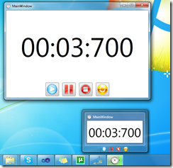
In WPF 4 there are some features which help us to easily integrate our software with Windows 7 Taskbar. Some of these features are showing thumb buttons in the thumbnail preview, showing progress in the taskbar item, accessing jump and task lists in items’ context menu. All of these features are nicely wrapped in classes and added as dependency properties to Window and Application classes.
 Windows 7 Taskbar components overview
Let’s start with describing what’s what in Windows 7 Taskbar.
WPF Classes for integration
Now, let’s take a look at the classes that WPF 4 provides for interaction with these components. All classes are defined in System.Windows.Shell namespace.
- TaskbarItemInfo – provides settings of how the taskbar thumbnail is displayed
- ThumbButtonInfo – represents a Thumb Button
- JumpTask – represents a shortcut to an application that can be started from the context menu
- JumpPath – represents a link to a file in the context menu
The Countdown Timer example
Now, for better understanding of the concept of using taskbar components, I have designed a simple application which just counts down one minute. I’ll explain it by breaking it down to its basic functionalities. Let’s take a look.
The Thumb Buttons
Thumb buttons are buttons which are displayed in the thumbnail preview (see overview picture above). They can be used as quick access to main functions of the application. They are defined using the ThumbButtonInfo class.
<Window.TaskbarItemInfo>
 <TaskbarItemInfo x:Name="taskBarItemInfo"
  ThumbnailClipMargin="40,40,40,100"
  Description="Countdown Timer">
  <TaskbarItemInfo.ThumbButtonInfos>
    <ThumbButtonInfoCollection>
      <ThumbButtonInfo
        DismissWhenClicked="False"
        Command="{x:Static local:MainWindow.CmdStart}"
        CommandTarget="{Binding ElementName=mainWindow}"
        Description="Start"
        ImageSource="Resources/play.png"/>
       <ThumbButtonInfo
        DismissWhenClicked="False"
        Command="{x:Static local:MainWindow.CmdPause}"
        CommandTarget="{Binding ElementName=mainWindow}"
        Description="Pause"
        ImageSource="Resources/pause.png"/>
       <ThumbButtonInfo
        DismissWhenClicked="False"
        Command="{x:Static local:MainWindow.CmdStop}"
        CommandTarget="{Binding ElementName=mainWindow}"
        Description="Stop"
        ImageSource="Resources/stop.png"/>
       <ThumbButtonInfo
        DismissWhenClicked="False"
        Command="{x:Static local:MainWindow.CmdReset}"
        CommandTarget="{Binding ElementName=mainWindow}"
        Description="Reset"
        ImageSource="Resources/reset.png"/>
       </ThumbButtonInfoCollection>
     </TaskbarItemInfo.ThumbButtonInfos>
 </TaskbarItemInfo>
</Window.TaskbarItemInfo>
Now, we can see that TaskbarItemInfo has sereval important properties:
- ThumbnailClipMargin – this is the area that will be shown on the application thumbnail
- Description – this is a description that will be shown in a tooltip above the thumbnail
Then we define the thumb buttons. For each button we can provide a description, a source of the image to be displayed, and a command to be executed (there are other properties, try to investigate them if you’re interested).
The Progress Indicator
Windows 7 can show a progress indication in the taskbar which is quite useful for some applications (for example Internet Explorer showing download progress, or in our countdown timer – the timer progress). TaskbarItemInfo has two properties for showing a progress indication in the taskbar.
- ProgressValue – a percentage value, ranged from 0 to 1 controlling the current progress
- ProgressState – an enumerable which controls the current state of the progress indicator.
ProgressState can take the following values:
- None – the progress indicator is not active
- Indeterminate – the progress is indeterminate
- Normal – a normal state, showing the current progress
- Error – the progress indicator shows the current progress, but highlights the bar indicating that there’s an error
- Paused - the progress indicator shows the current progress, but highlights the bar indicating that the progress is paused.
| None | Indeterm.. | Normal | Error | Paused |
Here’s how we can set the progress indicator in code:
taskBarItemInfo.ProgressState = TaskbarItemProgressState.Normal;
taskBarItemInfo.ProgressValue = 1.0 - currentTime.TotalMinutes;
The Jump List
We can allow our application to include it’s own shortcuts and file links in the context menu of the taskbar item. This is done by setting a property in the Application object, called JumpList:
<Application x:Class="Win7Shell.App"
             xmlns="http://schemas.microsoft.com/winfx/2006/xaml/presentation"
             xmlns:x="http://schemas.microsoft.com/winfx/2006/xaml"
 StartupUri="MainWindow.xaml">

 <JumpList.JumpList>
   <JumpList >
    <JumpTask Title="Notepad"
              Description="Open Notepad."
              ApplicationPath="C:\Windows\notepad.exe"
           IconResourcePath="C:\Windows\notepad.exe"/> </JumpList>
</JumpList.JumpList>
</Application>
So now Windows will display a shortcut to notepad in the context menu of the taskbar item of our application.
Be safe
Just a reminder when you use the taskbar integration of Windows 7 and WPF: The taskbar shortcuts, thumb buttons, progresses, are just to help the user see and do things more quickly. You should not use these components as your application’s main way of interaction with the user. Why? Because first of all, these components are not available in earlier versions of Windows. Also, even if the user runs Windows 7, there are some other concerns: for example the thumbnail preview is not available when Windows Aero is disabled. Of course, don’t worry, your application will still be able to run, just it’s taskbar functions will not be available.
Download Sample
You can download my Countdown Timer application to better understand the use of there components.


